
Responsive Website Development Company
Responsive Website Development Company
At Nispaara, we know a responsive website isn’t a luxury — it’s the foundation of every modern digital success story. As a leading responsive website development company in Bangalore, we combine design excellence, technical precision, and user-centered thinking to build websites that look great, perform flawlessly, and adapt to every screen.
We craft web sites that work beautifully on every device, and we've a reputation for getting results. We can Design one for you.
Whether you are new to responsive design or you have a previous knowledge on it, we will craft creative websites which are responsive to your customers.
Why responsive design is non-negotiable
- Device agnostic experience: From large desktop monitors to tablets and mobile phones — your site will adapt and stay usable. No pinching, no awkward scrolling.
- Better SEO performance: Search engines like Google reward responsiveness with higher rankings. When a site performs well across devices, bounce rates drop, and dwell time rises.
- Conversion & Engagement Growth: Visitors who can access and use your site easily are far more likely to become customers. Responsive design removes barriers.
- Lower maintenance costs: One site + one codebase = less work. Updates, content changes, and improvements happen in one place rather than multiple versions.
What we do: Our responsive website development process
Here’s how we deliver responsive websites that work well and work hard:
1. Discovery & Goal Setting
We begin by understanding your business, your audience, and your goals. What devices do they use most? What content and functionality matter most? These questions shape everything that follows.
2. Mobile-First & Flexible Design
We sketch wireframes and prototypes that prioritize small screens first. Then we scale up. This ensures the core user experience is solid on mobile — and enhanced on larger screens.
3. Fluid Layouts & Adaptive Content
Using flexible grids, relative units (like em/rem), fluid images, and responsive typography, your site will rearrange and adjust without breaking the layout.
4. Performance Optimization
Responsive design isn’t just about looks. Fast load times matter. We compress resources, lazy-load images, optimize code, and ensure smooth transitions because every second counts.
5. Cross-Device Testing
We test across multiple devices, browsers (Chrome, Safari, Edge, Firefox), operating systems, orientations. Usability on mobiles, tablets and desktops is verified. Issues are caught early.
6. Content That Scales
Whether it’s text, images, forms, or interactive elements — we make sure content looks sharp, loads fast, and stays legible and usable across all devices.
7. SEO & Analytics Integration
We build with standard SEO practices in mind: proper heading structure, meta tags, alt texts, schema markup. Once live, analytics help track usage, drop-offs, and opportunities for improvement.
8. Maintenance & Growth
After launch, we don’t just disappear. We monitor performance, update where needed, and help you evolve the site as your business and technology change.
Our expertise & Why choose us
Here’s what sets Nispaara apart:
- Years of hands-on experience building responsive sites for clients in India and globally.
- Multi-platform fluency: WordPress, Drupal, Joomla, custom HTML5/CSS3, JavaScript frameworks, etc.
- User-centric approach: design and UI/UX driven by actual user behavior, not assumptions.
- Transparency & communication: we share progress, insights, trade-offs. You’re never left guessing.
- Commitment to quality: performance, accessibility, and responsive behaviour are non-negotiables for us.
FAQ’s
What is responsive vs adaptive design?
Responsive design adapts fluidly to screen sizes; adaptive design uses fixed layouts defined for common device widths. We often use responsive first to ensure fluidity, then may layer adaptive elements where needed.
Does responsive design affect SEO?
Yes. A responsive website helps with mobile usability scores, loading speed, avoids duplicate content issues from having separate mobile sites, and improves core web vitals—all factors in modern SEO.
How long does a responsive website take to build?
Depends on complexity: number of pages, custom features, integrations, content readiness. Generally, for standard business sites, expect 4-8 weeks. More complex portals or eCommerce sites may take longer.
Let’s build something responsive together
If you’re looking for a responsive website development company that treats your site as more than just design — it’s performance, growth, and brand trust — let’s connect. Your site should work as beautifully on your client’s phone in hand as it does on a boardroom projector. And that’s what we build.
Industries we serve
Responsive healthcare websites
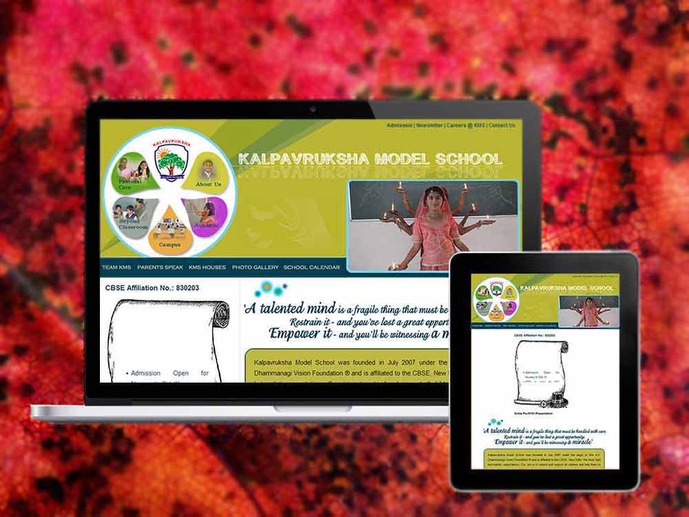
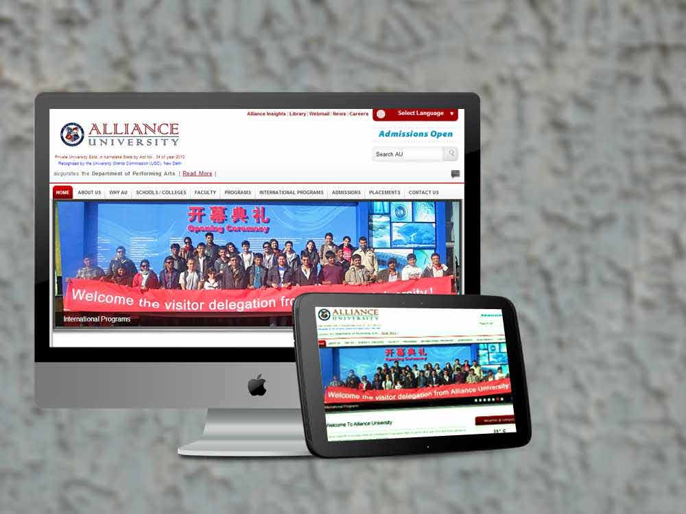
CMS websites for educational institutions
Responsive websites for IT industries


